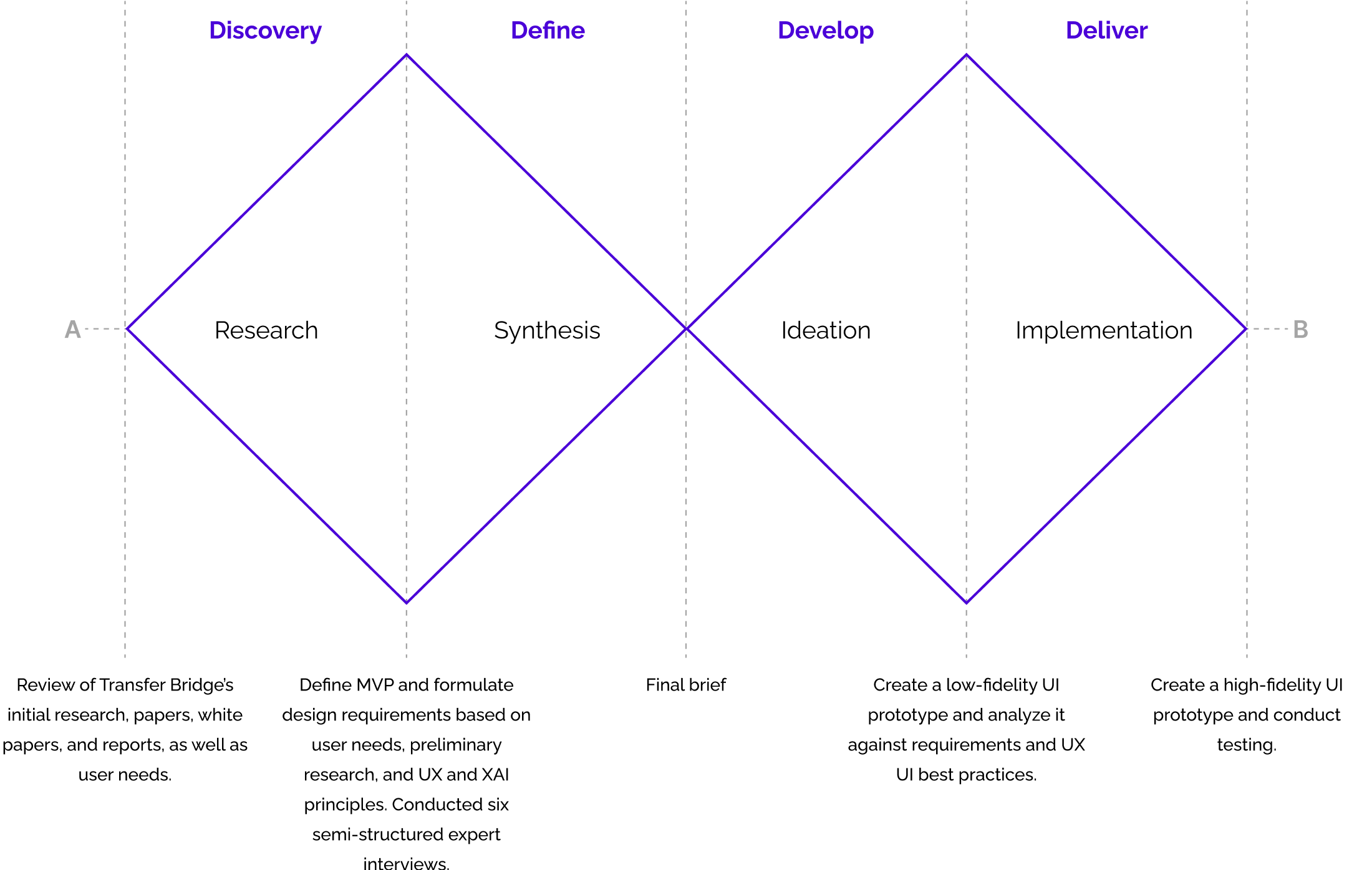
Research & Synthesis
Research: Conducted desk research, observations, expert interviews, and usability testing. The findings revealed three main pain points, which translated into design opportunities:
-
Pain Point: Complex layouts and inconsistent visuals made the system hard to navigate.
Opportunity: Design a simple, consistent interface that reduces cognitive load. -
Pain Point: Lack of transparency reduced trust in AI outputs.
Opportunity: Display clear, traceable sources as the primary way to validate results. -
Pain Point: Users were unsure of the tool’s capabilities and how to use them.
Opportunity: Strengthen affordances so users immediately understand functions and can take full advantage of the system.
Interviews Coding Tree: To extract insights from the interviews, six topics were established as the main focus, each with its own objective and narrowed to areas of usability priorities, user experience, contextual design, and system requirements.
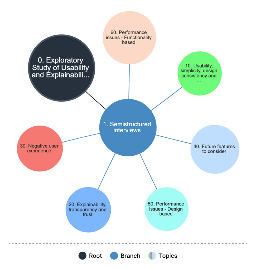
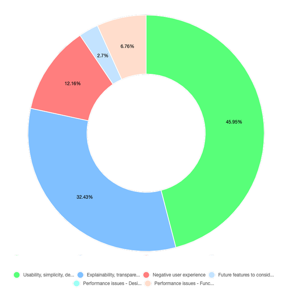
Themes Weight: The interviews highlighted the need for a simple and consistent interface, transparent sources to build user trust, and clear affordances so users understand the tool’s capabilities. Professionals were from areas of design, HCI, and computer science.
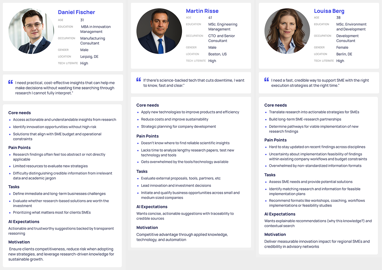
User Personas: To better capture user needs and pain points, I developed three personas derived directly from the findings of the semi-structured expert interviews and desk research.
Ideation & iMPLEMENTATION
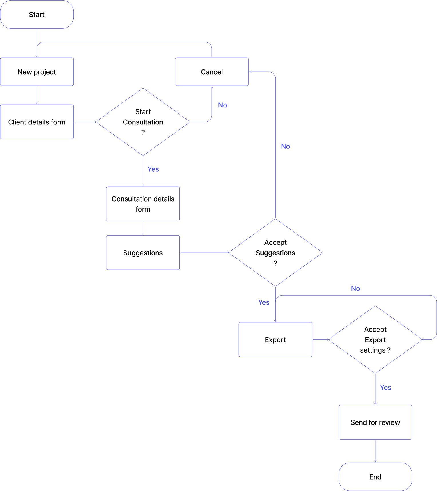
User Flow: The flow shows the consultation process: creating a project, adding client details, starting a consultation, filling out context-specific forms, receiving tailored suggestions, and exporting results. This structure keeps the experience consistent and easy to navigate.
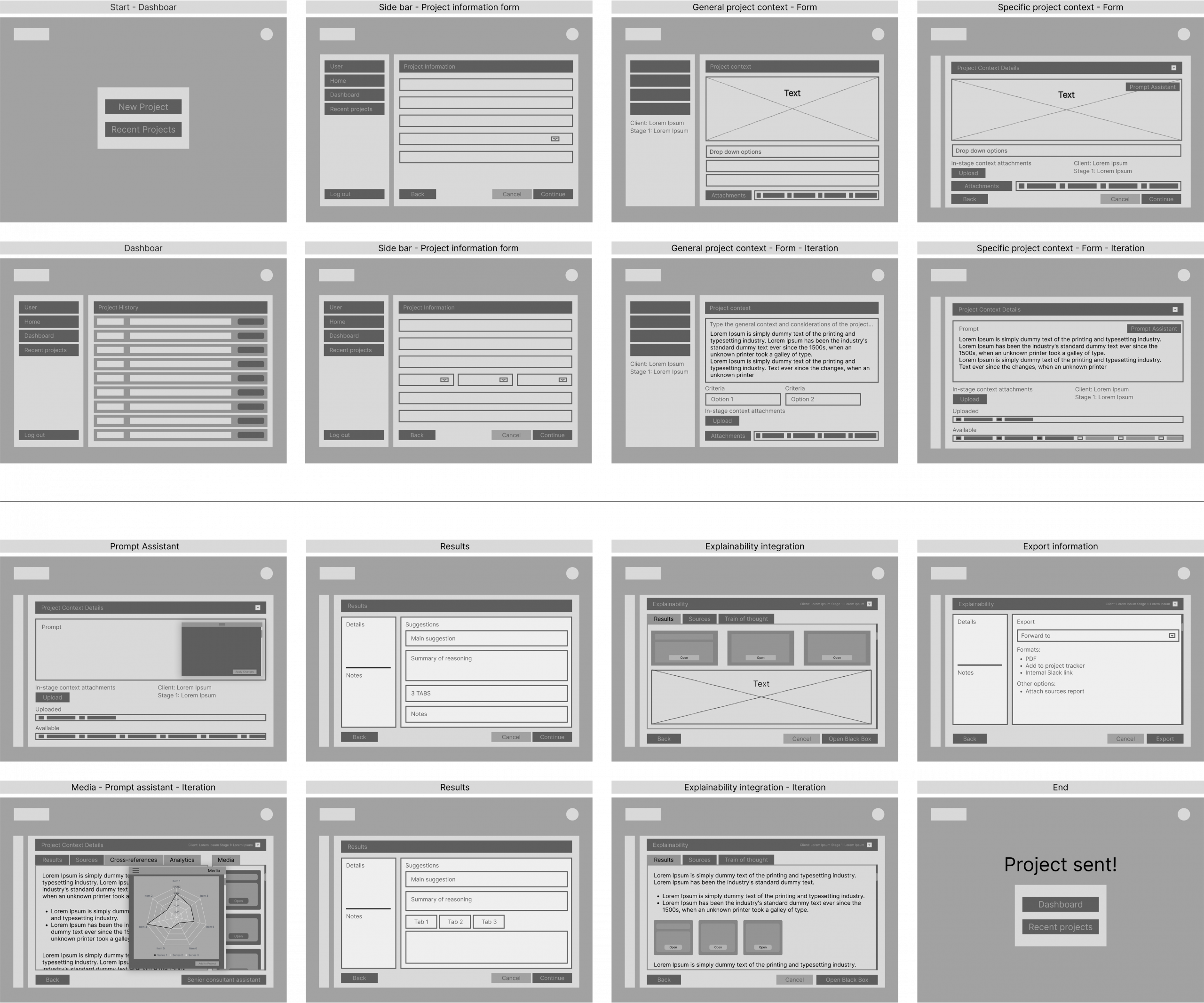
Wireframes: Created low-fidelity wireframes to map the information architecture, navigation flow, and key interactions while keeping visuals minimal. The wireframes covered core tasks such as starting new projects, entering client details, viewing system outputs, and exporting results. Some sections were refined and carried forward, while others were removed to keep the design simple and functional.
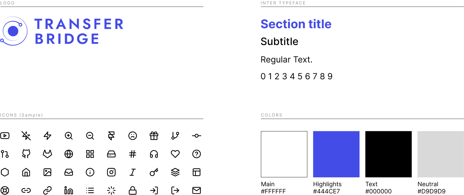
Brand Guide
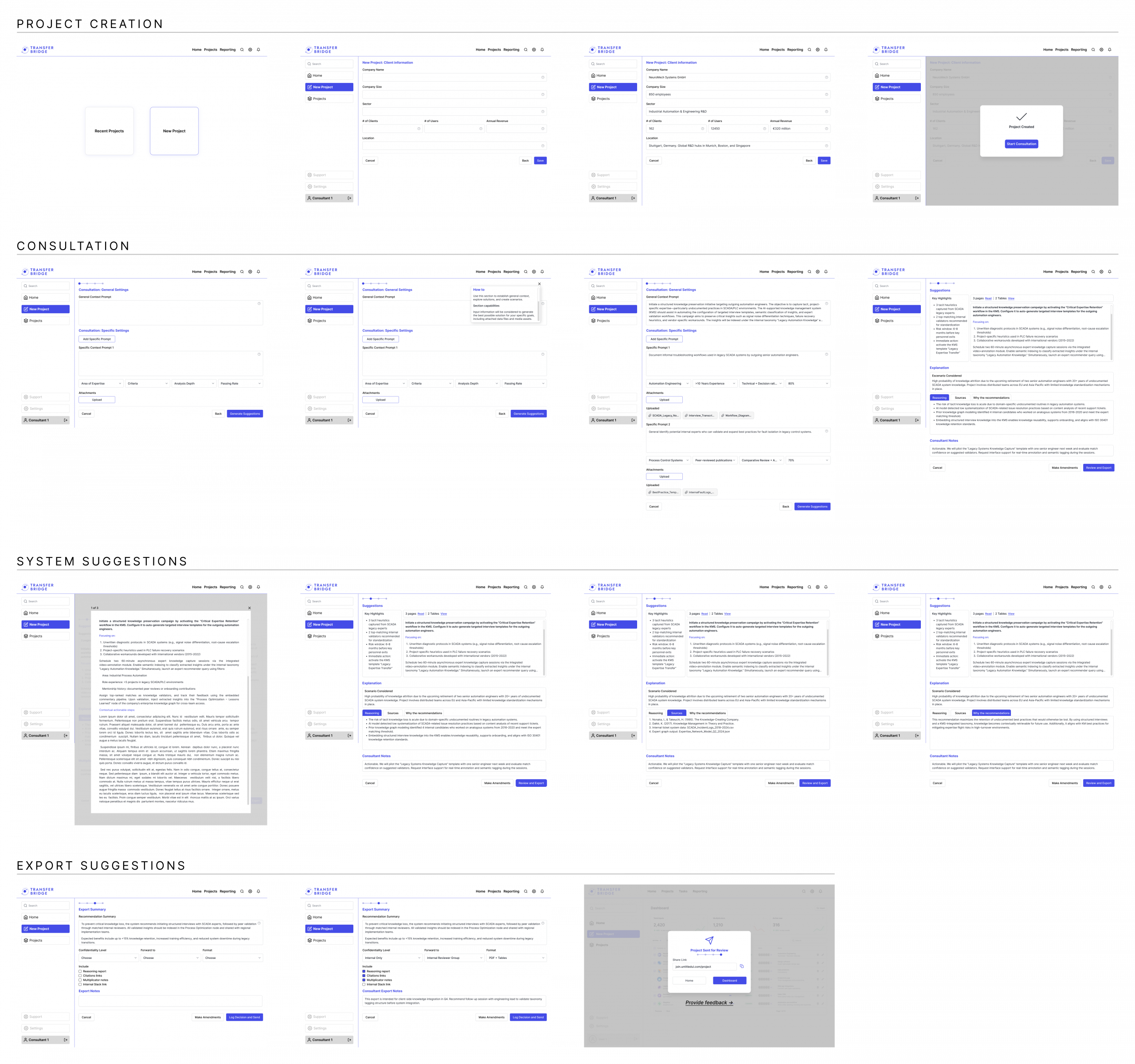
Prototype
Screens
Key learnings from the Transfer Bridge case study:
-
-
Research-Driven Design: Using insights from expert interviews and desk research ensured that design choices addressed real needs, guiding the development of wireframes and prototypes with purpose.
-
Usability and Clarity: Simplifying layouts, standardizing navigation, and keeping visuals consistent proved essential for making the interface easy to understand and navigate.
-
Trust Through Transparency: Providing traceable sources and explainable AI outputs helped establish user confidence in system recommendations and ouputs.
-
Clear Affordances: Highlighting what the tool can do and how to use it allowed users to fully leverage its features and improved the overall interaction experience.
-